America’s wild landscapes? They offer some of the most stunning color combinations you’ll ever see. I’ve wandered from the golden wheat fields of the Midwest to the deep forest greens of the Pacific Northwest, and honestly, these natural palettes have inspired more than a few designers (and maybe helped me pick a living room wall color or two).
Nature-inspired American color palettes totally dominate Pinterest boards. Why? They create timeless, calming spaces that just feel right—grounded, beautiful, and never out of style. I’ve watched colors pulled from the American outdoors—like desert terracotta, ocean blues, and prairie gold—consistently rack up the likes and saves on social media. People connect with these palettes because they remind us of home, adventure, and familiar feelings.
When I dig into what makes a nature-based color scheme work, I keep seeing the same thing: earthy neutrals, with a couple of accent colors straight from iconic American scenes. Maybe you love the soft pastels of a New England sunrise. Or you’re all about those rich browns in a Colorado canyon. Either way, these combinations give you endless options for creating Pinterest-worthy designs that actually feel American.

Defining American Color Palettes Inspired by Nature
American landscapes tell distinct color stories that translate beautifully into design. Regional influences shape how we use natural colors—especially in those Pinterest-perfect spaces.
Regional Color Influences Across the United States
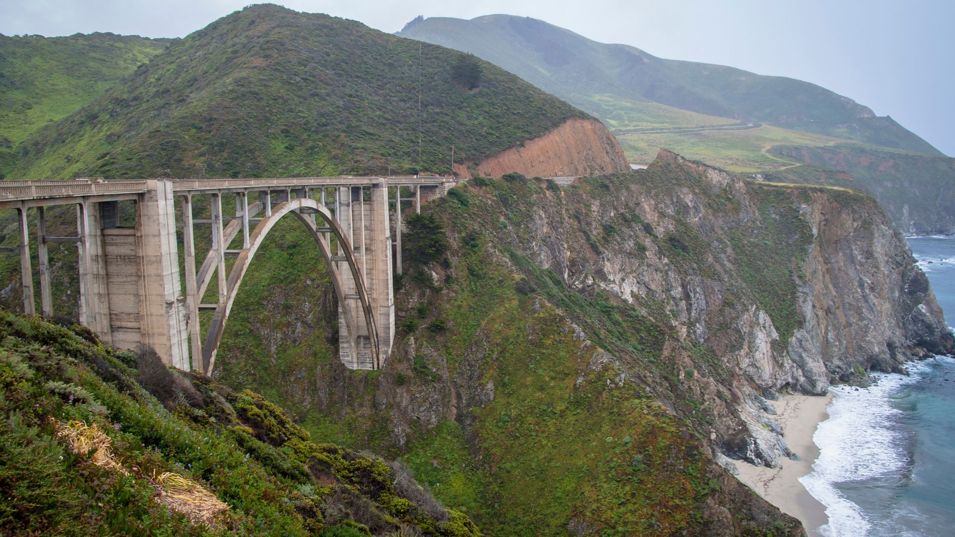
Pacific Northwest? Think deep forest greens, misty grays, and ocean blues. I see these shades in mossy trees and foggy coastlines. Sage green, charcoal, and seafoam really define the vibe.
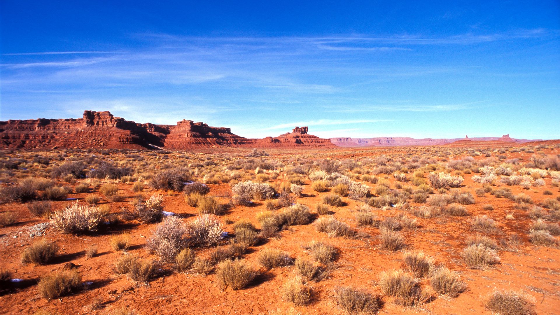
Southwest Desert brings warm terracotta, sandy beige, and sunset oranges. You’ll spot these in red rocks and desert sunsets. Clay tones and burnt sienna? Total classics.
New England colors come from autumn maples and coastal stones. I love the deep reds, golden yellows, and weathered grays—they’re pure fall foliage and rocky shorelines.
Great Plains offer wheat gold, prairie grass green, and sky blue. Wide open spaces create gentle, calming palettes that feel peaceful and soft.
Southern States? Magnolia white, Spanish moss green, and warm wood tones. Humid landscapes give you lush, welcoming colors that just feel like home.
Distinguishing Characteristics of Nature-Inspired Palettes
Nature-inspired American palettes have a few tricks up their sleeve.
Balanced Temperature is key—mixing warm and cool tones. I’ll pair forest green with sandy beige for a look that’s interesting but never jarring.
Muted Saturation keeps it real. You won’t find neon colors in most landscapes. Instead, natural palettes use softer, toned-down versions of pure hues.
Organic Relationships matter. Colors that show up together in nature just work—like ocean blues with sandy neutrals, or forest greens with brown bark.
Seasonal Variation lets palettes shift throughout the year. Spring brings fresh greens, while fall piles on the oranges and reds.
That’s how American nature palettes stay authentic and calming, no matter where you use them.
Why Natural Color Schemes Resonate on Pinterest
Pinterest users go wild for natural color palettes. They just photograph beautifully.
Visual Harmony makes photos look polished. These colors play nicely together and create those “wow” spaces that everyone wants to save.
Emotional Connection is real. Natural colors remind us of peaceful hikes, breezy beaches, or cozy cabins. That feeling keeps people scrolling.
Versatility is another win. Whether your style is farmhouse, modern, or rustic, natural palettes fit right in. That broad appeal means more shares.
Seasonal Relevance keeps things fresh. Fall colors trend in autumn, ocean blues in summer. There’s always something new to pin.
Easy Implementation? Absolutely. Most folks can find color inspiration just by looking out their window. That makes these palettes super accessible and fun to try at home.
Iconic Natural Palettes From American Landscapes
America’s landscapes? They’re a goldmine for color inspiration. Every region brings its own hues, shaped by geology, climate, and local plants.
Forests and Mountain Ranges
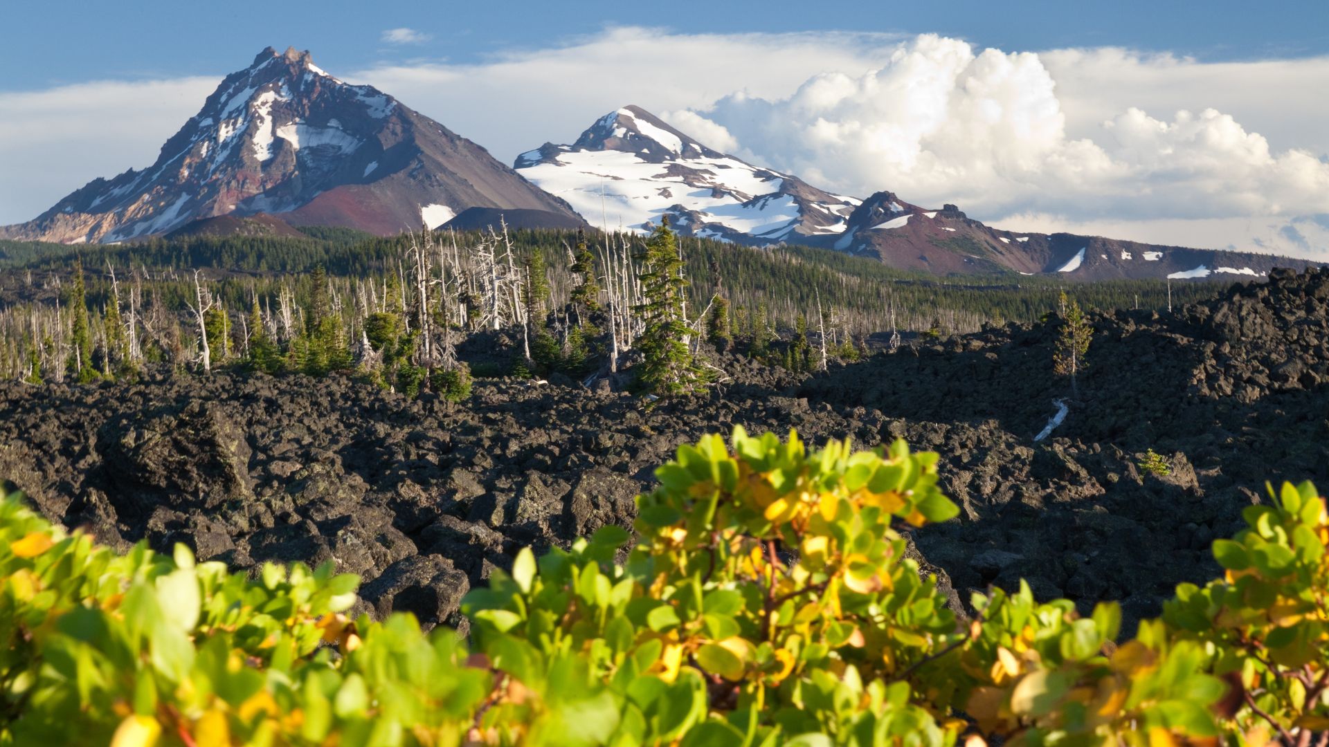
The Appalachian Mountains? Deep forest greens, misty blues, and soft grays all day. These colors make bedrooms and living spaces feel calm and inviting.
Key Colors:
- Hunter green from pine forests
- Slate blue from mountain mist
- Warm brown from tree bark
- Cream from birch accents
The Rocky Mountains go bolder. Snow-capped peaks pop against dark evergreens and granite grays.
Fall foliage adds a whole new layer. The Northeast lights up with oranges, reds, and golds—perfect for kitchens and dining rooms.
Pacific Northwest forests have their own thing going on: moss greens, cedar browns, and those soft rainfall grays. Earthy, moody, and totally unique.

Deserts and Canyons
Southwest deserts? Talk about drama. The Grand Canyon alone offers endless palette options from its layered rocks.
Desert Palette Basics:
- Terracotta and burnt orange from red rocks
- Sage green from desert plants
- Sand beige from canyon floors
- Deep purple from sunset shadows
Arizona’s Sonoran Desert mixes dusty blues from far-off mountains with warm cactus greens. I can’t help but use these for a southwestern-style home.
Utah’s red rock country? Rich rust and cream sandstone hues everywhere. Cozy, inviting, and easy to use in interiors.
New Mexico throws in turquoise accents from mineral deposits. That pop of color wakes up any desert palette.
Coastal and Oceanic Hues
America’s coastlines stretch for miles, and each one brings its own color story.
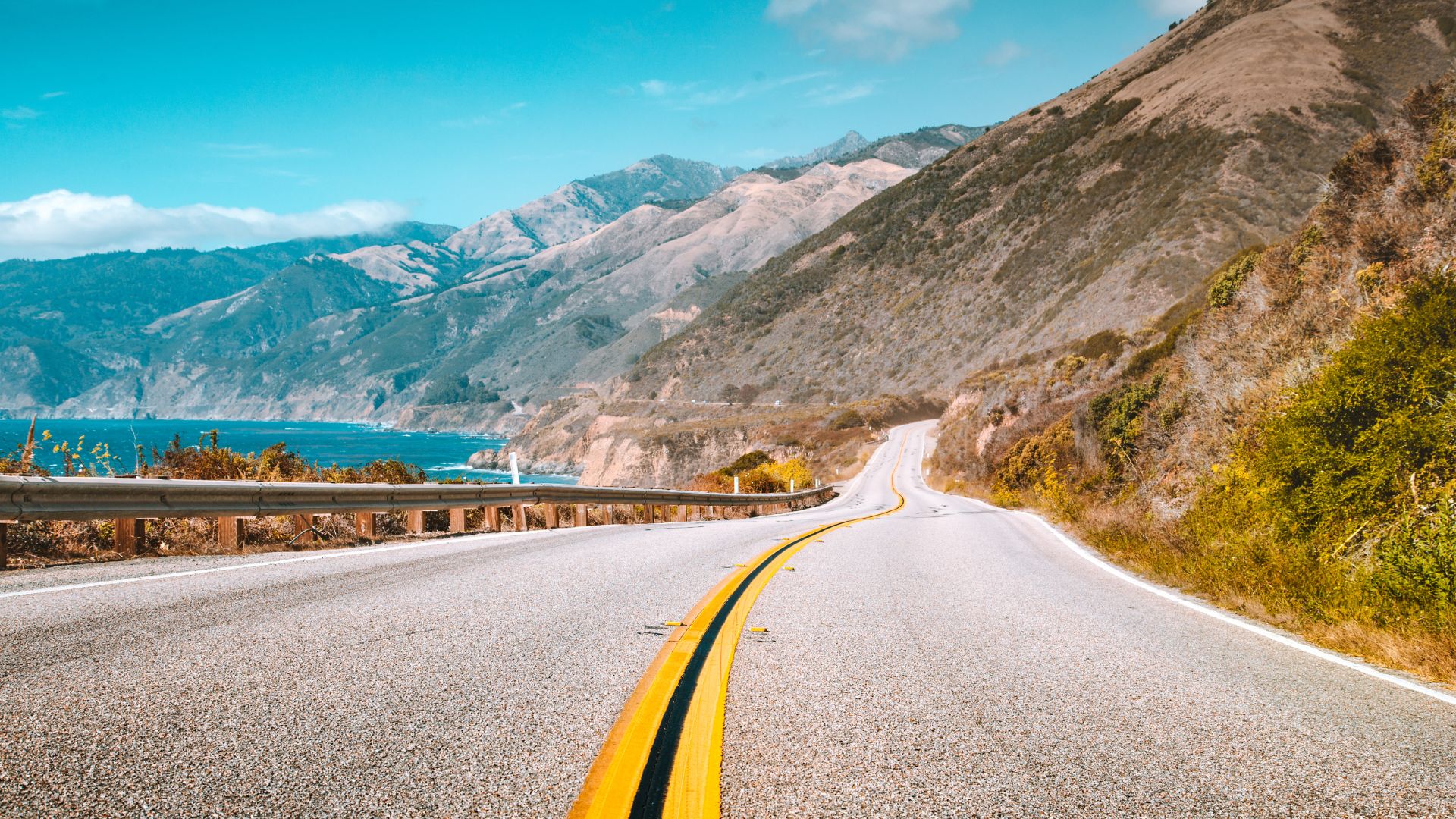
The Pacific Coast? Think stormy grays from fog, deep navy blues from the sea, and driftwood browns.
East Coast beaches take it softer. Cape Cod has soft blues, sandy beiges, and crisp whites—fresh and classic.
Popular Coastal Colors:
- Ocean blue, light to deep
- Sea foam green
- Driftwood gray
- Shell pink and coral
- Sandy tan
Florida’s tropical waters go all-in on aqua and teal. These bright blues make great accent colors in mostly neutral rooms.
Prairies and Grasslands
The Great Plains are subtle but sophisticated—often overlooked, but so good for modern farmhouse vibes.
Prairie Color Elements:
- Golden wheat from grain fields
- Sky blue from big horizons
- Soft purple from wildflowers
- Warm gray from old barns
Kansas sunflower fields add bright yellow pops. I use them sparingly so they don’t take over.
Montana grasslands shift color with the seasons—fresh greens in spring, bronze and copper in fall.
Prairie wildflowers keep things interesting. Purple coneflowers, black-eyed Susans, and Indian paintbrush offer ever-changing accent colors.
Color Palette Trends Dominating Pinterest Boards
Pinterest is all about nature-inspired combos that shift with the seasons and layer in rich textures. Cherry red and butter yellow are everywhere, usually paired with earth tones and bold accents for palettes that rack up the saves.
Seasonal Color Shifts
I’ve noticed real patterns in what’s trending through 2025. Spring palettes bring out butter yellow, soft greens, and cream. They’re all over home decor and fashion boards.
Summer trends are all about cherry red. You’ll see it in kitchens, on clothes, everywhere. People pair it with neutral Alpine Oat for balance.
Fall palettes go heavy on warm earth tones. Browns, deep oranges, and muted golds are everywhere in interiors and fall fashion.
Winter boards cool things down. Deep blues, grays, and whites set the base, with cherry red adding just enough warmth.
And here’s something interesting—seasonal transitions happen slowly. People start pinning next season’s colors about 6-8 weeks before the season actually starts.
Popular Palette Combinations
I keep seeing the same combos topping Pinterest’s trending boards.
Bold + Neutral pairs are huge:
- Cherry red + Alpine Oat
- Butter yellow + cream
- Deep forest green + beige
Three-color combos really pop:
- Cherry red + butter yellow + white
- Earth brown + sage green + cream
- Navy blue + coral + soft gray
Monochromatic schemes with texture are also everywhere. Boards built around one color—like sage green—use different shades and textures for depth.
Accent color strategies? Keep your main palette neutral, then add a bright color like cherry red to make it sing.

Textures and Natural Patterns
Textures make all the difference on Pinterest boards.
Wood grain works best with earth tones. Warm browns, cream, and sage green combine for a look that feels organic.
Stone and marble patterns show up with neutral palettes. Whites, grays, and soft beiges get a boost from these textures.
Fabric textures—linen and cotton especially—pair well with butter yellow and cherry red. I see these in both fashion and home pins.
Metal accents like brass and copper bring out the warmth in palettes. Gold tones love cherry red and earth browns, while silver fits with cooler schemes.
Natural patterns—leaf shapes, wood grain—add interest without stealing the show. They keep things organic and let the colors shine.
Practical Tips for Creating Pinterest-Worthy Palettes
Want to build a standout American palette? I’ve got a few tricks for pulling colors from nature, balancing them, and making sure they work across different platforms.
Extracting Colors From Nature Photos
I always take photos during golden hour. That soft light makes colors richer and avoids weird shadows.
Photo Selection Tips:
- Pick clear, well-lit shots—no heavy filters
- Look for multiple textures in the same color family
- Go for natural tone and saturation shifts
- Skip photos with lots of artificial stuff
I use the eyedropper tool in my design software to sample colors from specific spots. For example, I’ll pull three shades from one autumn leaf instead of sampling all over the place.
Sampling Strategy:
- Grab the dominant color first (usually covers 40-60% of the image)
- Pick secondary colors that work with your main hue
- Add accent colors from smaller details—use them sparingly
I steer clear of heavy shadows or blown-out highlights. Those extremes rarely look good in real life.
My best palettes always come from photos with natural color harmony. Desert landscapes, forests, and coastlines usually give you the most cohesive starting point.
Balancing Dominant and Accent Colors
Let’s talk about the 60-30-10 rule—it’s honestly the easiest way I’ve found to make any color palette look polished. Sixty percent goes to a dominant neutral, thirty percent to a secondary color, and just ten percent for a bold accent. This keeps everything visually balanced without feeling chaotic.
Color Distribution Guidelines:
- Dominant (60%): Soft neutrals—think cream, sage, or a cozy warm gray.
- Secondary (30%): Pick a medium-intensity color inspired by your favorite nature spot.
- Accent (10%): Go bold here; the brightest or most saturated hue works best for a little pop.
I usually grab some rectangles and size them to match those percentages. Playing around with these mockups helps me spot if the palette feels off or too loud. If it does, I’ll dial down the saturation on the secondary color by about 10-15%. It’s a small tweak, but it makes a big difference.
Balance Testing Methods:
- Make color swatches in the proportions you’ll actually use.
- Flip the palette to grayscale to check if the values still contrast enough.
- Try out combinations on different backgrounds—sometimes a color just doesn’t play nice with others.
Accent colors should catch the eye, but I never let them steal the show. I love pulling accents from tiny natural details—maybe a berry, a wildflower, or even a streak of mineral in a rock.
When I’m inspired by American landscapes, I tend to stick with earth tones as the base, add sky or water shades as secondaries, and save those super-vivid details for accents.
Ensuring Versatility for Digital and Print
I always run palettes through both RGB and CMYK color modes. It’s wild how colors that glow on your laptop can look flat on paper.
Format Compatibility Checklist:
- Digital: Test on different screens and play with brightness.
- Print: Double-check CMYK conversions to avoid weird color shifts.
- Accessibility: Make sure text stands out enough for everyone to read.
I jot down hex codes, RGB values, and CMYK percentages for every color. It’s a lifesaver when I need to share palettes with a team or use them in different projects.
Technical Specifications:
- Aim for contrast ratios of at least 4.5:1 for text.
- Keep saturation under 90%—anything higher can mess with print quality.
- Find and note Pantone equivalents if you’re doing pro-level printing.
Testing versatility means actually using the palette—backgrounds, text, buttons, graphics. The best palettes look good whether they’re the star or just in the background.
If Pinterest is your thing, make sure at least one color photographs well under regular indoor lighting. It’s a small detail, but it really helps your content pop.
Design Applications for American Nature Color Palettes
American nature palettes just work. They spark an emotional connection, whether you’re channeling the Red Rocks of Utah or bringing a bit of the Pacific Northwest into your living room. These colors move easily from landscapes to branding and home decor.
Home Decor and Interior Design
I love how grounded and peaceful a room feels with an American nature palette. The trick? Stick with three main colors as your foundation, then sprinkle in accents.
Desert Southwest palettes are my go-to for living rooms. I usually set warm terracotta as the dominant shade—about 60% of the space. Sage green comes in through furniture or textiles for 30%, and I finish it off with creamy accents.
Forest-inspired schemes make bedrooms and bathrooms feel like retreats. Deep greens and warm browns set a cozy mood. A little gold in the lighting or accessories adds just enough brightness.
The Pacific coastline palette breathes life into kitchens and dining rooms. Ocean blues, driftwood grays, and sandy beiges create a vibe that’s both fresh and timeless.
Lighting changes everything. I always recommend painting sample patches on different walls and checking them in morning and evening light. It’s surprising how much the mood can shift.
Branding and Digital Media
American nature palettes have a way of building trust in branding. They feel authentic and approachable, which is probably why I see them everywhere in digital spaces.
Organic and wellness brands thrive with prairie-inspired colors. Golden yellows and soft greens instantly communicate health and natural vibes. They look great on websites and social feeds.
Tech companies often lean into mountain-inspired palettes. Slate blue and granite gray together feel stable and easy on the eyes—especially important for software where people stare at screens for hours.
Travel and tourism brands need to spark wanderlust. I pull sunset colors from places like the Grand Canyon—deep oranges, purples, and golds—to create that sense of adventure.
For websites, I use the lightest palette colors as backgrounds and reserve the darkest shades for text and navigation. This keeps things readable and still feels true to nature.
Event and Wedding Planning
Let’s talk about creating celebrations that actually feel special—and look amazing in photos. I love drawing inspiration straight from nature and the changing seasons across America.
Autumn weddings? Nothing beats the colors of New England’s fall. Deep burgundy, golden orange, and forest green come together in a way that just works, whether you’re saying “I do” in a rustic barn or a fancy ballroom.
Spring celebrations have their own vibe. The Pacific Northwest gives us soft lavender from lupine, fresh fern greens, and those misty grays you see on rainy mornings. I’ve used this palette at baby showers and graduation parties, and it always feels fresh.
Summer events feel best with coastal Maine in mind. Navy blue, crisp white, and touches of weathered silver set a sophisticated mood. These shades fit right in at outdoor gatherings, no matter if you’re going formal or keeping it casual.
I always think about how colors will translate in photos. Natural palettes tend to shine, whether the sun’s blazing or you’re under twinkle lights. Plus, they look fantastic on invitations and signs—trust me, your guests will notice.